Autumn is now in full swing. It’s the time to get cosy and warm at home as the rain gently taps the window.
You can probably guess that this is my favourite time of year. I find Autumn more inspiring and creative than I do spring or even summer. And I think that is reflected in my Autumn Collection.
I added some new products a few weeks ago, which you can view here. But let’s take a look at my creative process behind the designs.
Inspiration
Inspiration can come from anywhere. Most of my inspiration comes from when I am being creative myself. I like to switch off and do some digital design or a mindless doodle, and sometimes an idea arrives and I note it down in my notebook or in my phone if I am out and about.
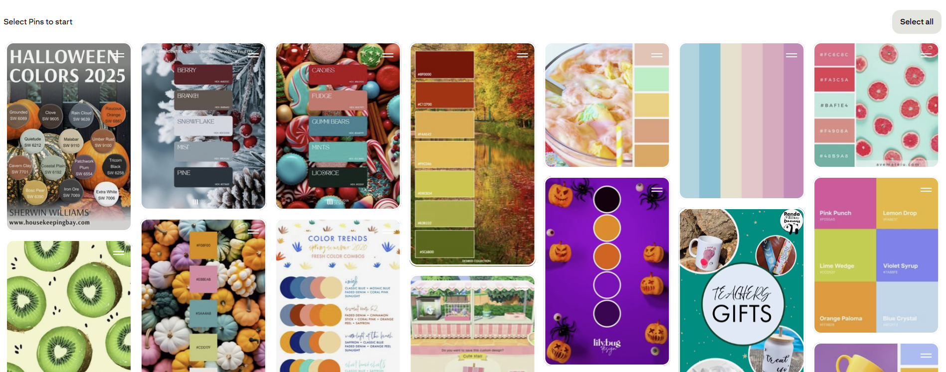
But what I really like to do is scroll through Pinterest looking at colour palettes, or finding some funny sayings or puns. I avoid looking at other people’s artwork as that could lead to copying, and that is something that I would like to avoid. (Obviously, a like on that pin is a bonus to that artist) And AI image generation is also a big no-no.
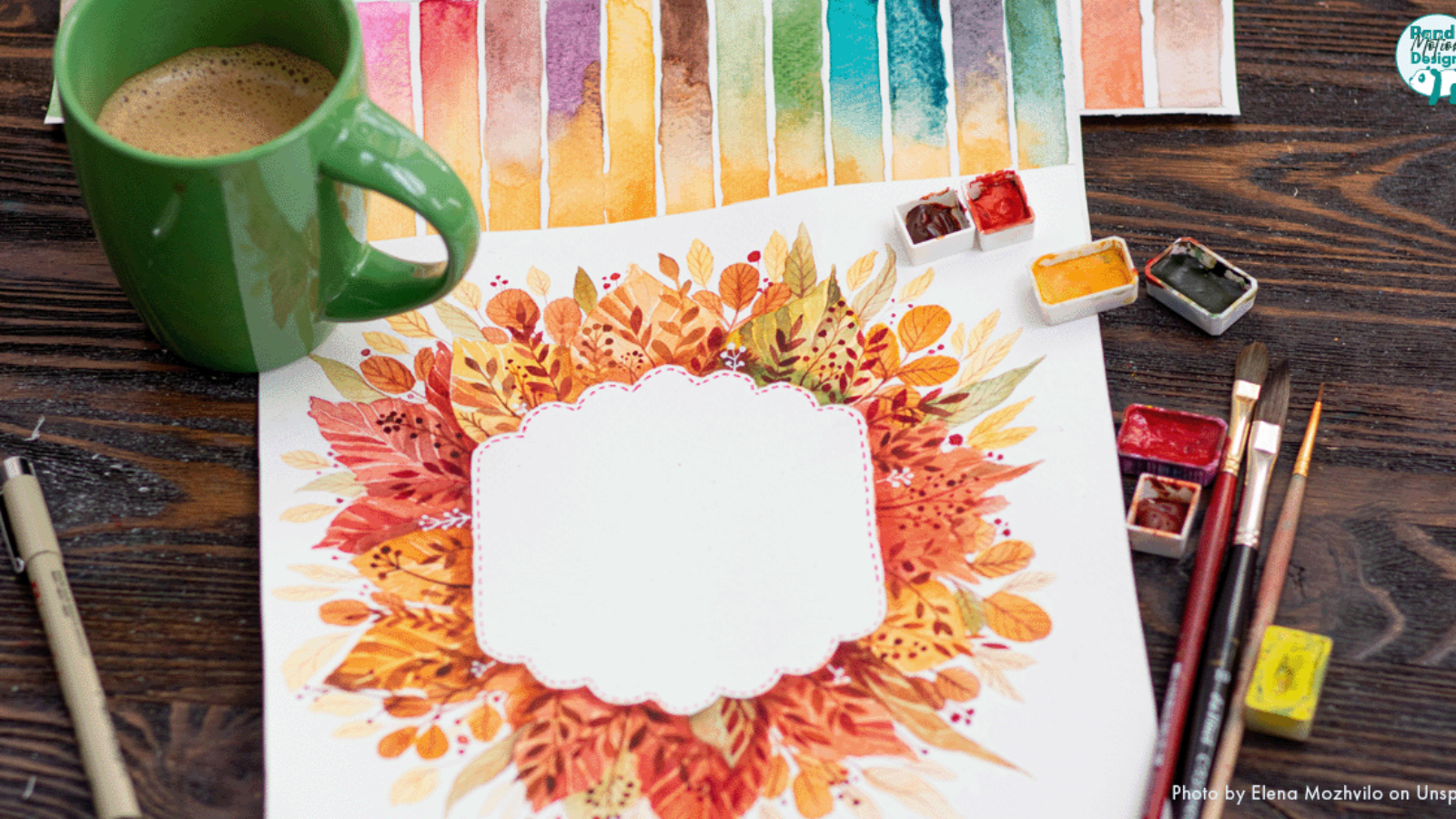
Autumn is great for colour. You have so many warming oranges, cheery yellows and fiery reds to inspire.
Framework
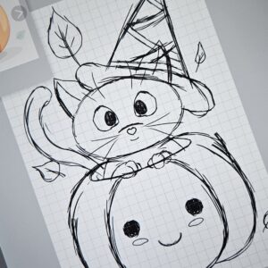
This is when the sketchbook or notebook comes out. This is the point where I start to gather in reference images (if needed), the colours, and start planning which product this design would be pressed onto.
Now is the time to begin the early sketch. The basic shapes and positioning are the main focus. Detail comes later, keeping in mind how this design will sit on the sublimation products.
I like to have references; it helps keep me focused and ensures proportions are correct, as well as helps with poses. Definitely needed for my Cat tote bag. Nothing beats curling up in your big autumn jumper, with a hot drink and drawing a peaceful Autumn vibes image.
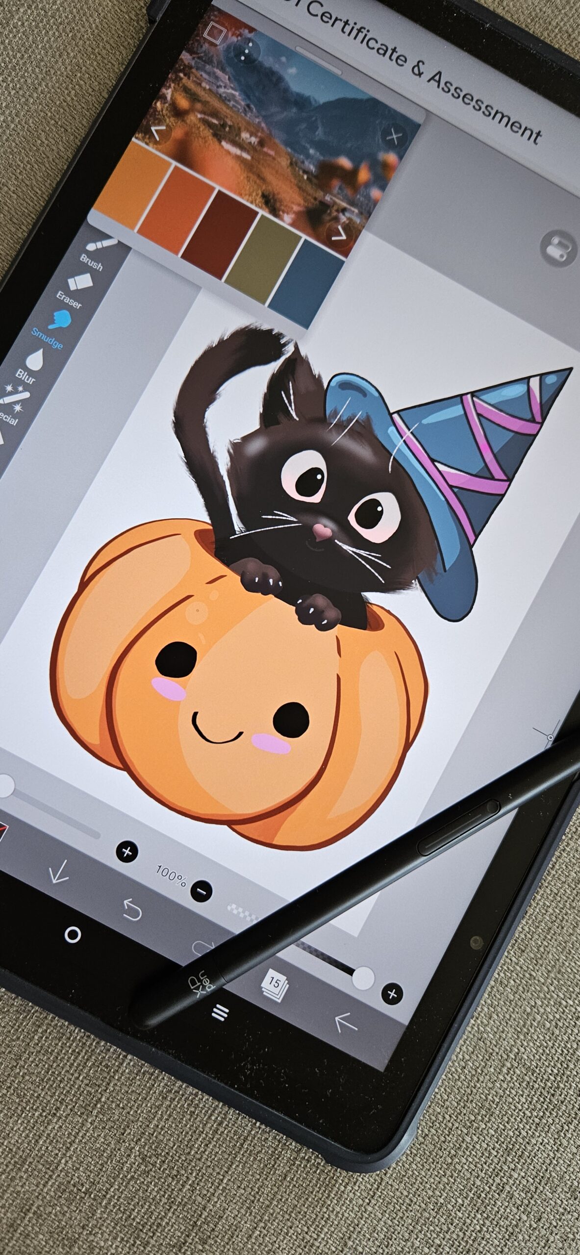
Creation
Time to refine and build up the details. Once I was happy with the final drawing or digital design, it was time to put it into Photoshop to resize and define the image to fit onto the product. I would also sometimes tweak the colour slightly, as it does come out dull in the sublimation printer, but once pressed, it is very vivid, and some colour enhancement can really help the colour pop.
The final step is to use the heat press on your test product. This can be quite a nerve-wrecking part of the process, as I have already put in so much time and effort on these designs, it can be disheartening when it doesn’t come out as you had hoped.
I have to say, orange is one of the best colours to see after a press is one of the best things about doing sublimation because it just gives an immediate warmth.


And now it’s ready to upload to Etsy
Many thanks for taking the time to read my blog. I hope this has been a helpful insight into my creative process. Please feel free to leave a comment below.
You can also follow me on social media.
Until next time…keep shopping small
Leave A Comment